Hello everyone! Elin here.
Glad to be back after my vacation, and oh my what a challenge we have got this week!
But I have to admit that this was rather fun!
I still have one of my first cards laying around, and it might come as a shock to you that back then when I started scrapping I was all about CAS (clean &simple)...
What, What, WHAT? :-)
What, What, WHAT? :-)
That's not even remotely possible these days, with all the goodies Sandra has to offer in her store.
And as if that wasn't enough, I only made 15 x 15 cm, or 6 x 6 inch cards the first year.
I never do those anymore, but for today I've done the same size as back then.
AND to top it all, my first cards didn't have any images or sentiments.
Well, I had to put a sentiment on the new one, or I'd freak out...haha XD
Oh well...time to show you my old card and then go hiding under a table. :-)
Here is my old card from 2008:
Here is my old card from 2008:
...and here comes 2013:

As you might notice, my taste of colours has changed a bit over the years.. What's up with all the red??
The past year I've been all about pinks, purples, brown and whites as you can see here:
Oh how I absolutly LOVE these bark hearts, they make my day for sure. The sentiment reads:
"Especially for you" and makes the card suitable for any occasion really.
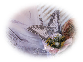
The lovely butterfly is from Pion Design's last colletion: Almas.
Time to celebrate Easter here in Norway. I will be doing that by working loads, and eating loads of marzipan! And maybe I'll find some time to create too ;)
Thank you for stopping by.
Hugs & Kisses


Absolutely stunning, the difference in your cards is amazing, today's card has a beautiful softness about it. I like your older one too, but prefer today's card. xxx
ReplyDeleteWoW - So utterly beautiful and soft <3.... Hey your older card is lovely too. Hehe the very first cards I did were all CAS too... Jen xxx
ReplyDeleteThank you for sharing your journey... it's so amazing to see how people change as crafters and creatives - amazing remake!
ReplyDeleteAlison x
Wow, what a difference. Beautiful, when you mentioned you don't make 6x6 cards anymore you have had me intrigued for some time now. What size are your cards and the 3 punched layers are they part of the card or stuck on the top.
ReplyDeleteI have wondered how you do the punched layers.
Love your work
Angie
Thank you so much girls, every comment makes me smile <3
ReplyDeleteAngie; Im a huge fan of paperbags, and most of them are 4 x 6 inch. I also use some of them who are longer, but not sure the inch there.
When it comes to the layers, I ofthen use a puncher on the top of the paperbag first, then I use the same puncher on the front panel. Finaly I always make a large tag to fith into the bag, and this one also get punched on the top.. so it looks like loads of layers ;) Thank you for your kind words!
Do you have a tutorial on what you do or pictures of the inside to see how the base is done. Never done a paperbag card before and all the you tube ones seem to have a pocket on the inside flap but not from the top. Confused. So intrigued.
ReplyDeleteThanks Angie